Data Analysis Tutotial
Mock Data Analysis Assignment Instructions
For this Mock Data Analysis Assignment, you'll analyze and visualize interview and quantitative survey data. Use the resources from Sessions 1-4 to support you with this assignment.
Analyzing Interview Data
Before you Start
- Download this data set: MSSE Coaching Data and the End of Coaching Survey
- Watch this video for a step-by-step approach to analyzing interview data. Be sure to take notes because you'll use these steps during the mock analysis activity.
Start Your Analysis
- Analyze the interview data.
Additional Context
This data set is a combination of the quantitative and qualitative results of the End of Coaching Survey given to teachers related to a coaching setting. Each of the survey responses are listed in the data set. For example, the 1-10 rating for question #1 (Based on your experience this school year, how likely would you be to recommend coaching to a colleague?) is listed in column A of the data sheet. The open response for #2 is in column B, etc.
This narrative will be combined with the narrative below.
Analyzing Quantitative Survey Data
Additional Context
Using the same data set as above, you're now going to analyze the quantitative data. These are the actual Likert survey questions to which the participants responded. However, in the data set, the raw scores for Question 1 in Column A of the 1-10 scale were modified to:
- Not at all satisfied
- Somewhat satisfied
- Moderately satisfied
- Very satisfied
- Extremely satisfied
For Questions 6 & 7 a scale of not at all, a little, moderately, notably, or significantly was used, but numerical values for these descriptors were not assigned. You'll need to assign numerical values to each descriptor (Ex. 1 = not at all; 2 = a little, etc.)
When creating data visualizations, since the scale descriptors are not the same, a graph of Question 1 will need to only show Question 1 data, but the results of Questions 6 & 7 can be on the same graph because the descriptors are the same.
| NOTE: When creating your own instruments, we suggest a narrower range of options like 1= Strongly Disagree, 2=Disagree, 3=Agree, 4=Strongly Agree, and NOT using a neutral response. That forces participants to make a choice when they are leaning one way or the other. Also, when designing instruments, think about using common descriptors so that data can be compared more easily. |
To analyze the data, watch this video. Brian is a graduate of the MSSE Program and he explains the process well. If you're new to using Excel, some of the clicks he makes may not be familiar to you; don't worry, he explains the Outcome of what he is doing. If you get confused, we suggest you refer back to the Excel Tutorials on Linkedin Learning.
Start Your Analysis
Analyze the data in an Excel spreadsheet using the steps below:
- Set up the quantitative data in a new Excel spreadsheet for Questions 1, 6 & 7.
- Enter the data for each of the questions.
- Perform the same statistical analysis Brian modeled in his video (mean, mode, and percent distribution of each score).
- Using the data visualization tips in the Session 4 tutorial, create either a stacked column or stacked bar graph. You should have one graph representing Question 1, and one combined graph for Questions 6 & 7.
Assignment Narrative
Now that you've completed your analyses, it's time to write the results using Claims - Evidence - Reasoning. Watch this video on writing a narrative using CER. It will be important to understand this format, as you'll use CER to write Chapter 5 of your capstone paper.
| Claim | In most cases, you'll start with the quantitative data. Describe the results using the name of the instrument. Report the findings in your narrative and end with a reference to any graphs or figures you've created. This is the Claim. |
|
Evidence
|
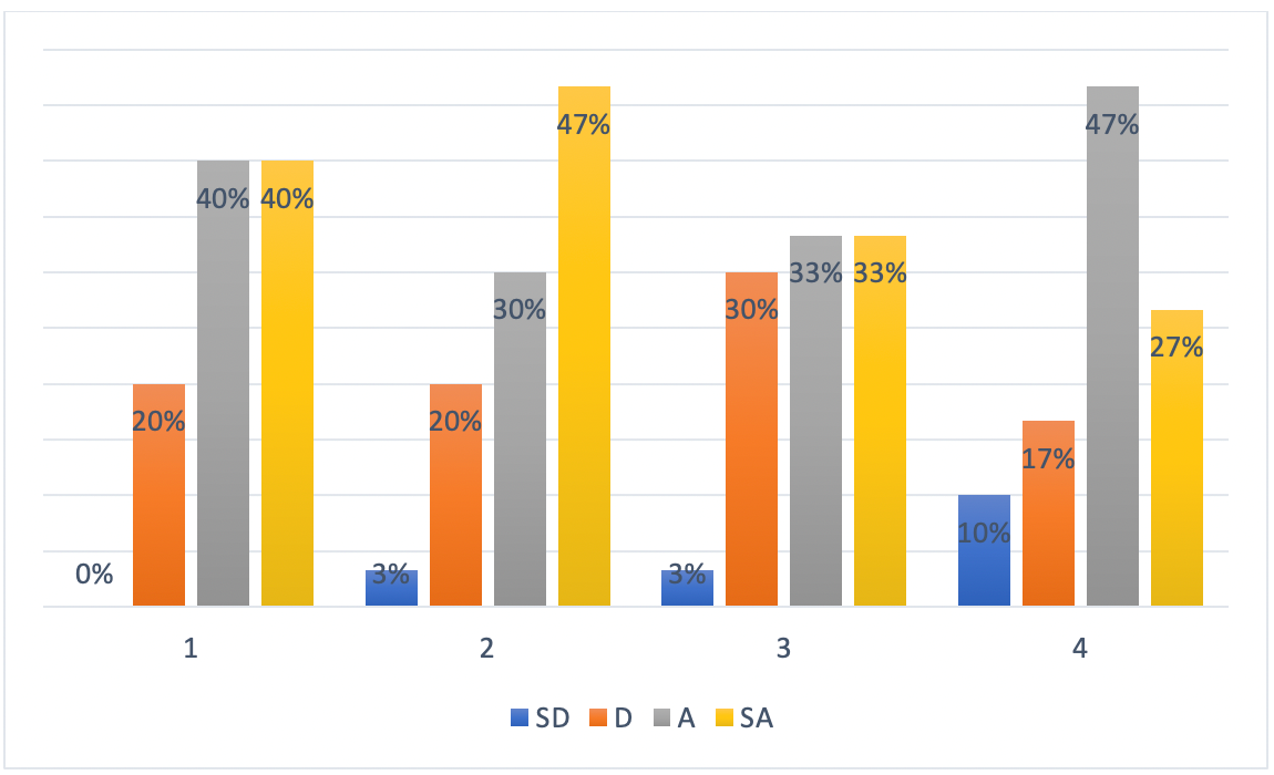
In the same paragraph, support your claim using the qualitative data as Evidence. This information is interwoven in the paragraph as either a paraphrase of the qualitative data or as direct quotes. Here's an example: The results of the Graves Inquiry Survey indicated that 55% of the participants strongly agreed that using inquiry strategies with their students increased students' participation in class. Another 40% agreed that the strategies increased students' participation. One respondent said, "I was shocked at the attention my students gave to the lesson after I used a case study." Another stated that the attention rate of her class was starkly different after two days of using the strategy of introducing a unit of study with a phenomenon event (Figure 3).
Figure 3. Graves Inquiry Survey Results, (N=30). Note. 1=My participation in class increased;
2=I understand the material better; 3=I learn science better; 4=I can write a CER
statement.
Your evidence should be supported by data visualizations created in Excel to tell the story of the data, and demonstrate your understanding of the best practices outlined in Session 4. These best practices can be found in the Linkedin Learning modules and in the formatting resource for tables and figures. |
| Reasoning | Wrap-up the paragraph by describing why the evidence supports the claim. |
.png)