Data Analysis Tutorial
Session 4: Data Visualization
Overview
In Sessions 1-3, you learned about research methods and the data analysis techniques within comparison and descriptive methods. In Session 4, we'll explore data visualization using Excel so that you can put this information into action in the Mock Data Analysis Assignment.
As you dig into these tutorials and complete the mock data analysis activity, we want you to focus on these three concepts, as outlined in Using Graphs and Visual Data in Science by Egger and Carpi (n.d.).
- Visual representations of data are essential for both data analysis and interpretation.
- Visualization highlights trends and patterns in numeric datasets that might not otherwise be apparent.
- Understanding and interpreting graphs and other visual forms of data is a critical skill for scientists and students of science.
Resources and Modules on Data Visualization
In Session 4, you'll get acquainted with data literacy through data visualization by completing multiple modules and resources. Before you get started, check your MSSE course to see if you've been assigned any alternative or additional tasks by your instructor for Session 4. In this session, you'll complete the following:
Data Visualization: Best Practices (Time Estimation: 2 hours)
- First, click on the link to open Linkedin Learning via MSU's Library where you'll choose Linkedin Learning at the top of the page. After clicking on the link, log in with your NetID and password. Type in the course title "Data Visualization: Best Practices" into the search bar.
- Complete the following sections in the module:
- Watch all 8 instructional videos under "1. Why Data Viz Matters."
-
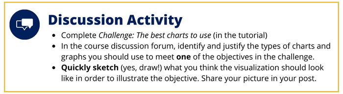
- Watch all 5 instructional videos under "2. Identifying and Shaping Your Data," then complete the challenge. Once you're done with the discussion activity, watch the Solution: The best charts to use video.
-
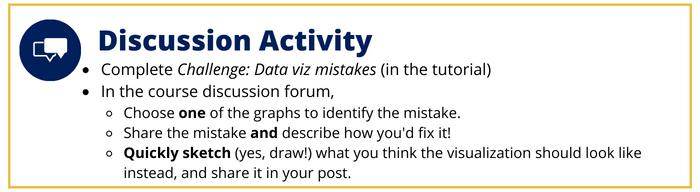
- Watch all 7 instructional videos under "3. Data Viz Mistakes to Avoid" then complete the challenge. Once you're done with the discussion activity, watch the Solution: Data viz mistakes.
Excel Data Visualization: Mastering 20+ Charts and Graphs (Time Estimation: 3 hours)
Before you dig into this module, you'll need to make sure that you have Excel (free for all MSU students) downloaded. You can access the download here. Not only will you need Excel to engage with this module, but you'll need it for your capstone project too. Excel is the software that all MSSE students will use to create data visualizations for their capstone paper.
- First, click on the link to open Linkedin Learning via MSU's Library where you'll choose Linkedin Learning at the top of the page. After clicking on the link, log in with your NetID and password. Type in the course title "Excel data Visualization: Mastering 20+ Charts and Graphs" into the search bar.
- Complete the following sections in the module:
- Watch the introduction and all 3 instructional videos under "1. Data Visualization Best Practices."
- Watch all 5 instructional videos under "2. Customizing Charts in Excel."
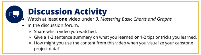
- For the rest of this tutorial, you'll choose videos under "3. Mastering Basic Charts and Graphs" that help you complete the Mock Data Analysis Assignment; keep this tutorial open while you work on your assignment.
Additional Resources for Session 4
- Watch this video on writing a narrative using Claims - Evidence - Reasoning.
- Review Session 4 Resources in the Data Analysis Tutorial Readings & Tutorials notebook.
- Proper formatting of Figures and Tables for MSSE.
Mock Data Analysis Assignment
End of Session Reflection